DFC


As a leading Australian land developer, Dennis Family Corporation (DFC) builds masterplanned communities designed around connection and longevity.
During my time at Clear Design, I delivered brand-aligned design solutions for two of their precincts in Victoria: Manor Lakes and Ashbury. I delivered extensive retainer based assets for Manor Lakes, spanning large-scale print and digital campaigns, newsletter and publication layouts, stage releases, event design, and motion assets. For Ashbury, I specialised in event design and collateral to drive engagement across community activations.
Manor Talk is a quarterly digital newsletter for Manor Lakes residents. Built on the brand's core design system, it’s crafted for flow, versatility, and ease of use. Each issue extends beyond the newsletter itself to include matching social posts and EDMs. While working within a templated system, every edition required keen attention to detail and strong typographic hierarchy across both short and long-form copy. Curating page layouts and selecting the right imagery were also key to delivering a cohesive final outcome.
Category:
Brand, Publication


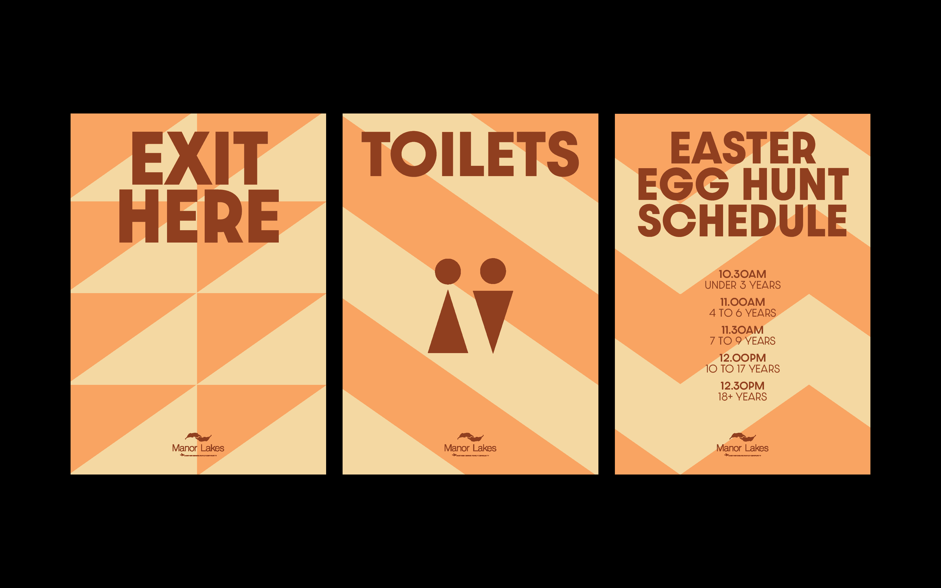
The annual Manor Lakes Easter Egg Hunt called for a brand refresh, which I delivered under the guidance of our Creative Director. The brief centered on adapting a pre-existing brand asset, a handmade paper artwork of a rabbit and an Easter egg, and building the entire event design around it.
To complement the geometric nature of the paper art, I chose a matching typeface and rotated the ‘g’s to bring a playful, whimsical feel, envisioning them rolling into place like eggs in motion. Type hierarchy was established using varied weights and scales. The colours and patterns from the hero egg were then mapped onto broader touchpoints, stretching a cohesive visual language across event signage and wayfinding.
Category:
Brand, Event



The Village, a neighbourhood within Manor Lakes, featured stage releases as part of our retainer work. Each release carried its own theme while adhering to a shared structural framework, requiring adaptability while remaining true to the templated system.
The paper creatives determined the look and feel for each release: the hero image served as the cover, and its colour palette informed the rest of the design. Because the stage release brochures were produced for both print and digital, colour accuracy and cross-medium usability were critical. In addition to the physical and digital brochures, matching social posts and EDMs were designed for each launch.
Category:
Brand, Layout


Manor Lakes briefed us in to develop brand led promotional videos for social media using footage from recent photoshoots at the precinct.
The brief introduced five distinct pillars, one for each video. With various promotional objectives, these assets were created to target different demographics and serve as evergreen content for the Manor Lakes brand over time.
Category:
Brand, Motion, Video
To launch Ashbury’s family-focused Summer Community event, I led the initial design exploration and client presentations under the Creative Director's guidance. The brief called for a magical, fairytale theme centered around princes and princesses. Working from the client's initial moodboard, we first needed to name the event to set the right tone. Together with the Creative Director, we developed Once Upon a Festival; a title that captured the fairytale spirit and sparked anticipation.
Taking cues from fairytale book covers, I developed a custom suite of illustrations and a wordmark lockup. The colour palette was deliberately kept muted to stay aligned with the Ashbury brand identity.
I presented two distinct creative directions: a pattern-driven concept where typography and illustrations intertwined across the canvas, and a modular "blocking" concept that separated text and illustration into distinct units.
The client selected the modular direction, and was interested in establishing it as a reusable framework for future Ashbury events.
A key highlight of the chose direction was its kinetic application, allowing each illustration to be animated in continuous loops within its block for a vibrant and fun addition to the campaign.
Category:
Brand, Illustration, Event


When Ashbury’s Easter Egg Hunt came around, the client briefed us to take the modular design system established for Once Upon a Festival and adapt it for the Easter holiday.
Briefed to lead the design exploration and presentation, I started by exploring the wordmark. To maintain continuity with the previous event while giving Easter its own identity, I selected a similar soft serif typeface, using a bolder weight to hold more visual presence against the lighter header copy.
We presented two colour options: a high-energy palette featuring an almost neon yellow, and a more pastel, brand-aligned option. The client chose the softer pastel palette for its seasonal feel.
Building on the modular system, I developed kinetic motion graphics for social media, animating the illustrations to bring extra personality and fun to the promotional rollout.
Category:
Brand, Illustration, Event


