MPAC


Monash Performing Arts Centre (MPAC) is the home of live music, dance, theatre, and festivals. Designed by studio Clear, the identity is built as a strong, recognisable, yet minimalist brand system that adapts across all media while keeping the performance at its core.
During my time at Clear, I was briefed on several event-based projects for MPAC. From digital assets to print collateral, I rolled out materials for individual performances and developed the brand applications for their major 2026 promotional campaign.
The Season 2026 Campaign allowed the MPAC brand to stretch its creative boundaries. I was given the brief along with the creative freedom to explore new directions, working closely with the Creative Director for guidance and support. While utilising core brand elements and principles, the brief called for a distinct variation from everyday event collateral.
The MPAC identity is inherently minimalist, prioritising performance imagery paired with Helvetica Neue brand typography. While seemingly structured, this system opened up opportunities for a dynamic typographic treatment—delivering a versatile campaign look that remained faithful to the core brand.
The staggered typography and mirrored outline type added depth and texture to the campaign layout. This typographic approach translated seamlessly into motion, creating a strong sense of energy and anticipation across digital channels.
Category:
Brand, Campaign


Parallel to the Season 2026 Campaign, I was tasked with developing an evergreen campaign for the summer season. The brief called for a consistent visual approach to maintain cohesion across all promotional materials.
Working with a client-provided tagline, adopting the staggered and mirrored outline typography was the natural direction.
For the motion assets, however, I tailored the approach to suit a different context. Designed specifically for on-campus digital screens, the typography was applied dynamically over still imagery. This required a calmer, low intensity kinetic treatment to ensure high legibility while maintaining the campaign's visual signature. The campaign approach was combined with the signature MPAC pink.
Category:
Brand, Campaign


As part of its repertoire, MPAC hosted Nacht II, an audiovisual performance defined by stark, high contrast light design in a darkened space. Working under the guidance of the Creative Director, I was briefed to design and develop the promotional campaign assets.
To reflect the show's dark, immersive aesthetic, I adapted MPAC’s signature split-screen layout by shifting the solid block to black, and hence maximising the visual punch of the performance imagery. We explored several layout variations with different copy configurations, ultimately landing on a prominent show title paired with a smaller tagline to create a balanced, high impact composition.
Category:
Brand, Event

The Monash Academy Orchestra (MAO) needed promotional assets for their upcoming auditions. Working from provided footage, our task was to align two motion pieces with the core MPAC brand while keeping the spotlight on MAO.
Because the video loop for the website header needed to be fully responsive, I centred the typography in the frame to serve as a stable visual anchor across all screen sizes.
For the main promotional video, I had more room for flexibility. I introduced MPAC’s signature brand pink as a transitional element and applied a split-screen colour block system to ensure campaign copy remained crisp and legible over dynamic video footage.
Category:
Brand, Campaign, Video

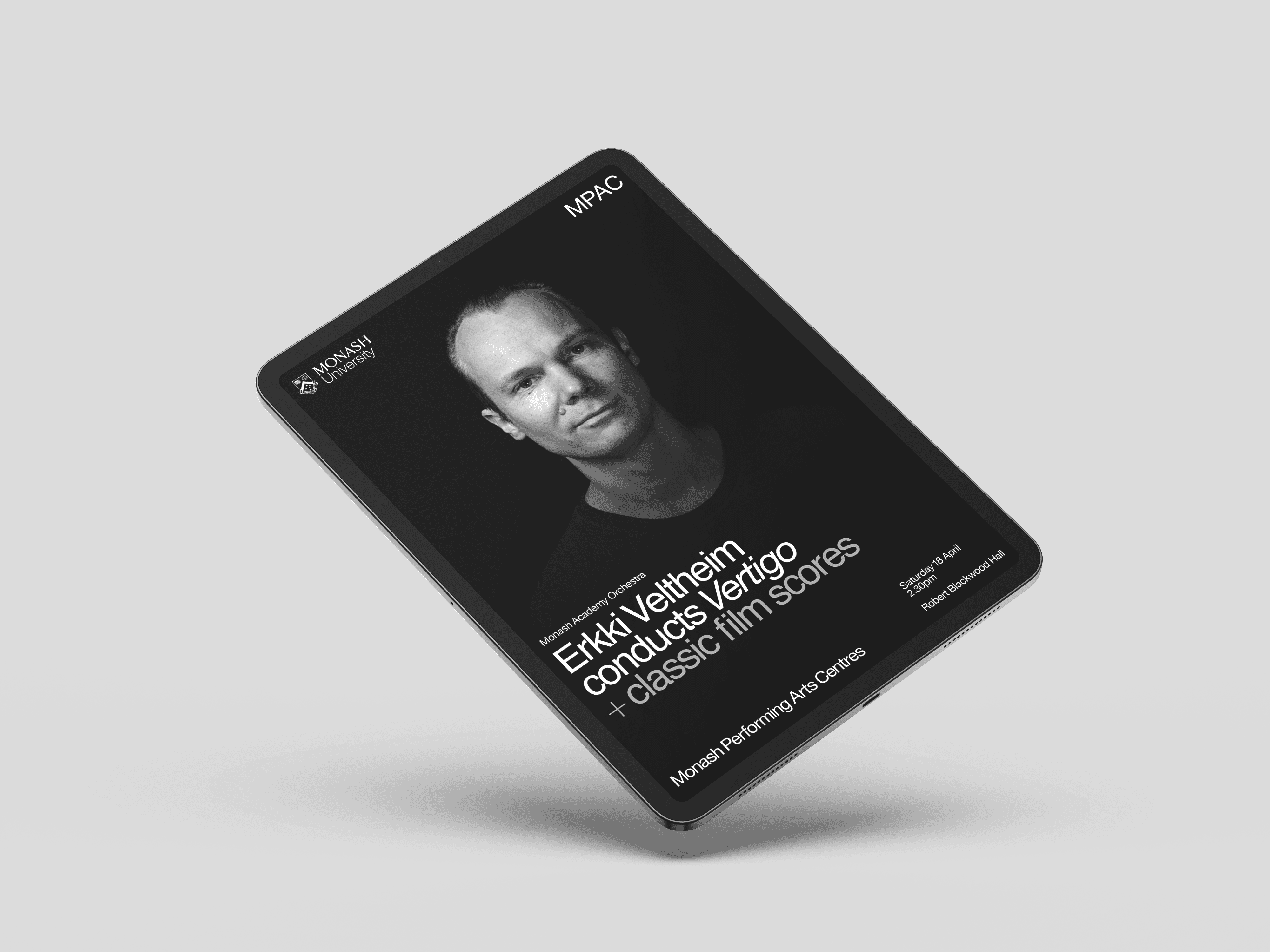
Monash Academy Orchestra hosted guest conductor Erkki Veltheim, requiring promotional screens for campus displays alongside a digital event program.
The MAO sub-brand uses monotone event photography, and because the provided hero image featured a dark background, I opted for a solid black layout block. This created a dramatic contrast that immediately drew attention to the conductor and event title.
Designing the digital program required a meticulous, detail-oriented approach to suit the scaled-down design approach. Establishing precise typographic hierarchy and absolute clarity was paramount across both long-form and short-form copy.
Category:
Brand, Event


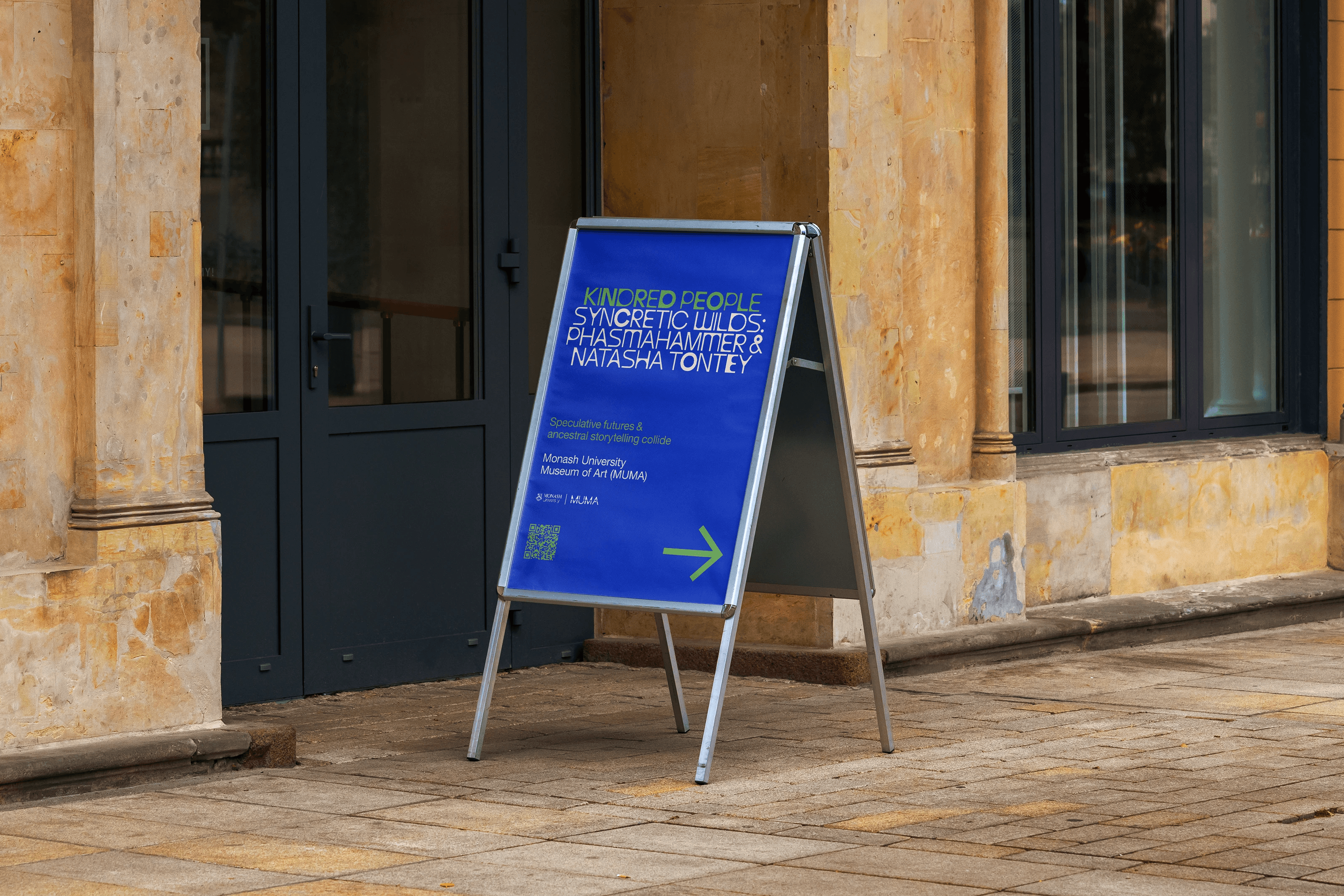
As part of the Kindred People festival, I was tasked with rolling out a suite of assets that demanded a highly considered typographic approach to balance multiple dense content elements per page.
Beyond designing the DL flyers and A-frame wayfinding signage, I developed two kinetic promotional assets set to the festival's signature soundtrack: a cut-down motion piece highlighting a specific performance, and a multi-artist promo utilising still imagery.
While the Kindred People identity was developed independently by the studio, all layouts were structured to remain strictly faithful to the overarching MPAC brand system.
Category:
Brand, Event